FENTY BEAUTY
Kendo Brands
Production Designer
RYAN WONG
brand design & production
FENTY BEAUTY
Kendo Brands
Production Designer
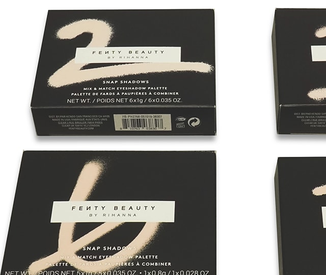
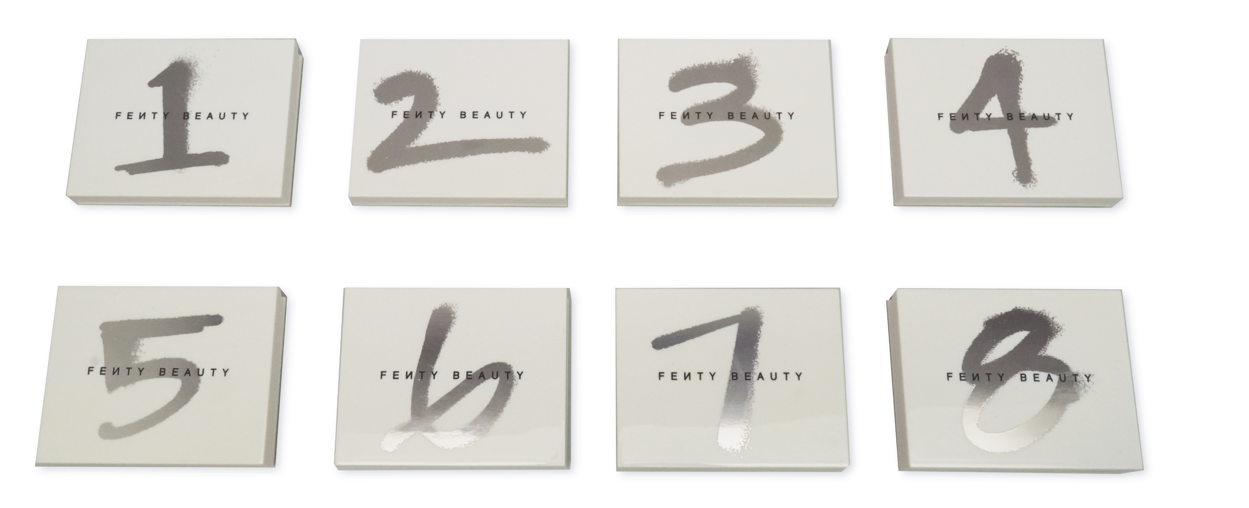
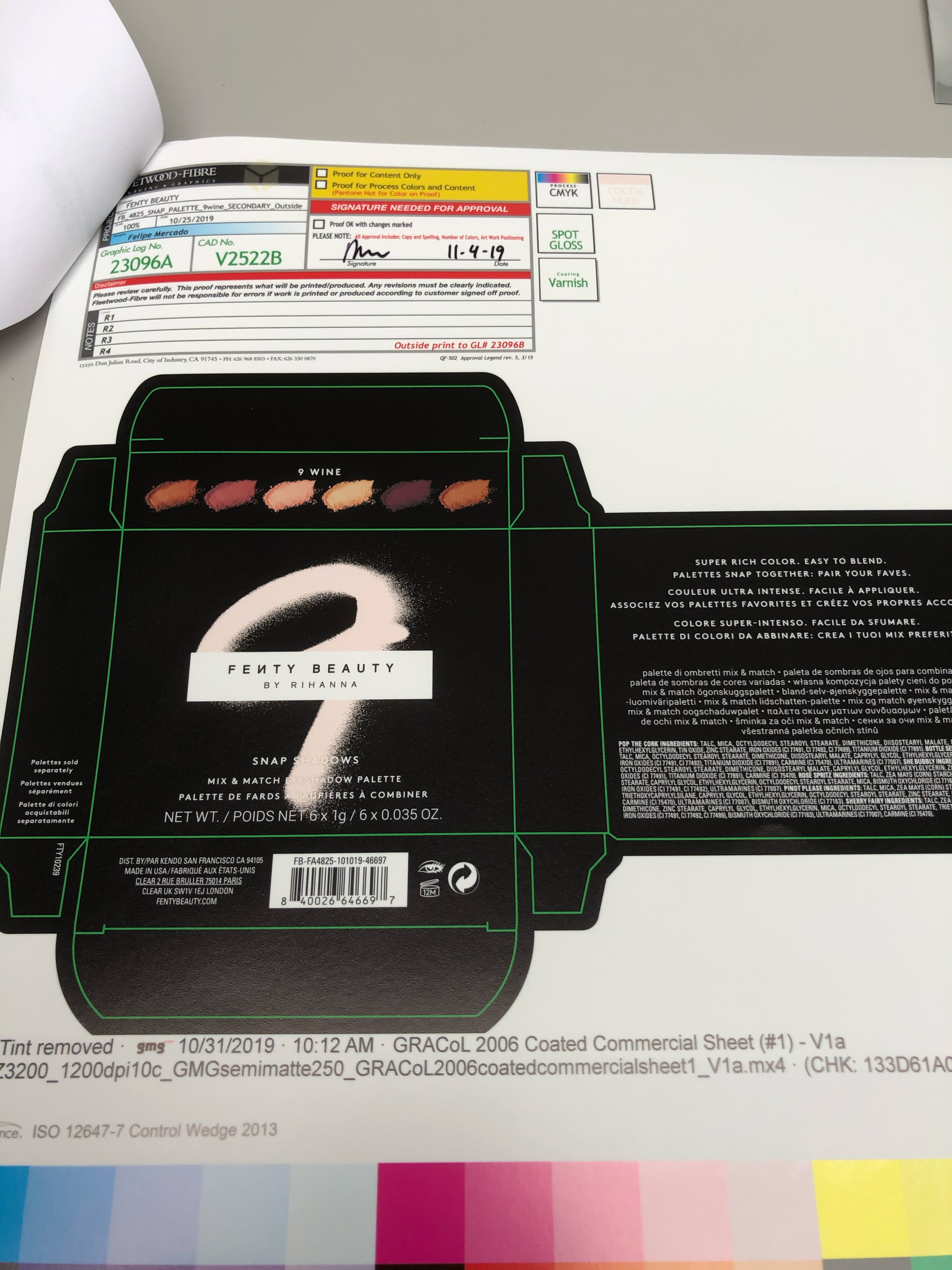
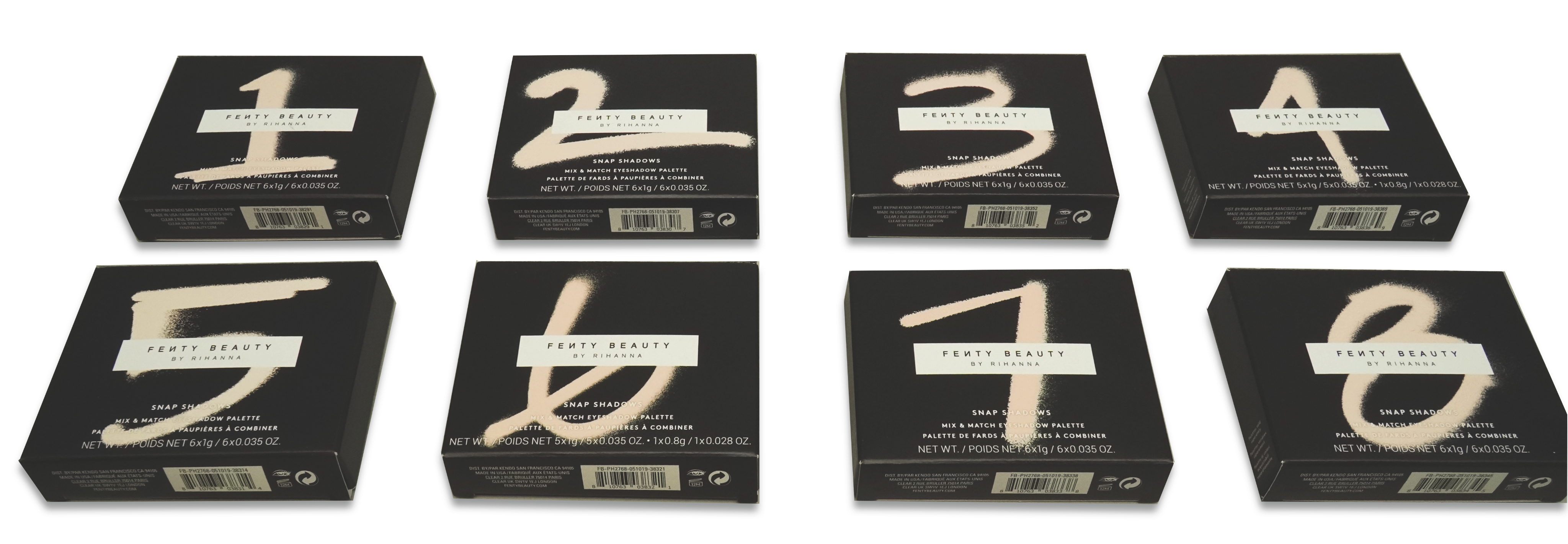
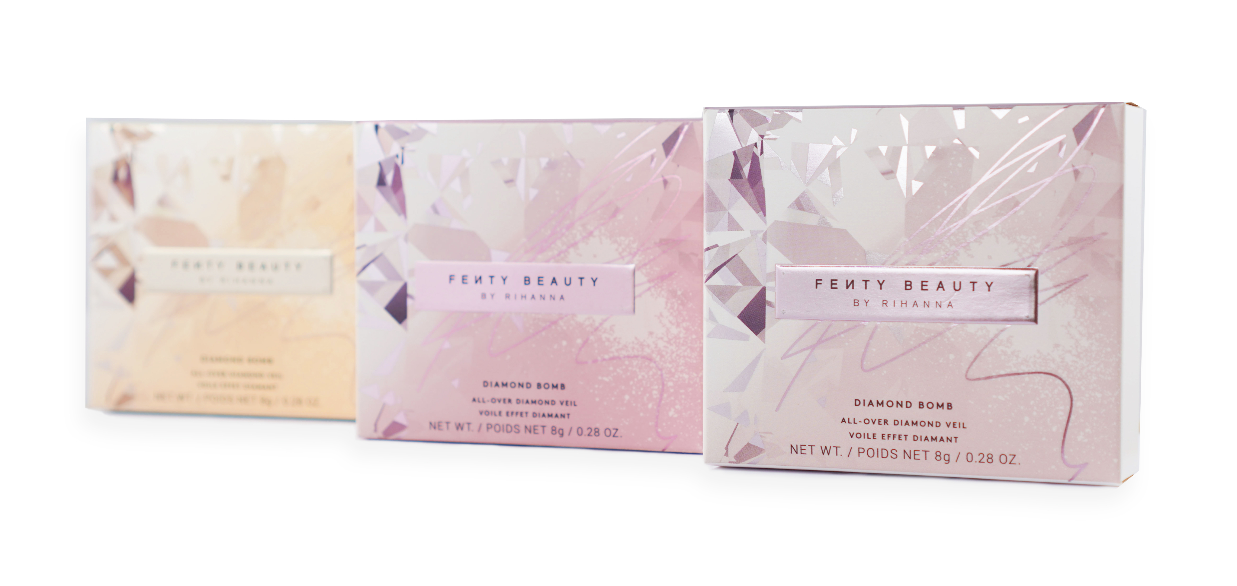
Highlighting two projects I worked on for Fenty Beauty – Diamond Bomb and Snap Shadows. Snap Shadows are a series of eyeshadow palettes which can be combo’d up to create a look. There are 8 palettes with different type of shades that can be mix-matched to create your own look. We wanted the packaging to be more practical by placing large numbers on it, so the user could quickly decide which look they wanted to go with or combo with using a number system.
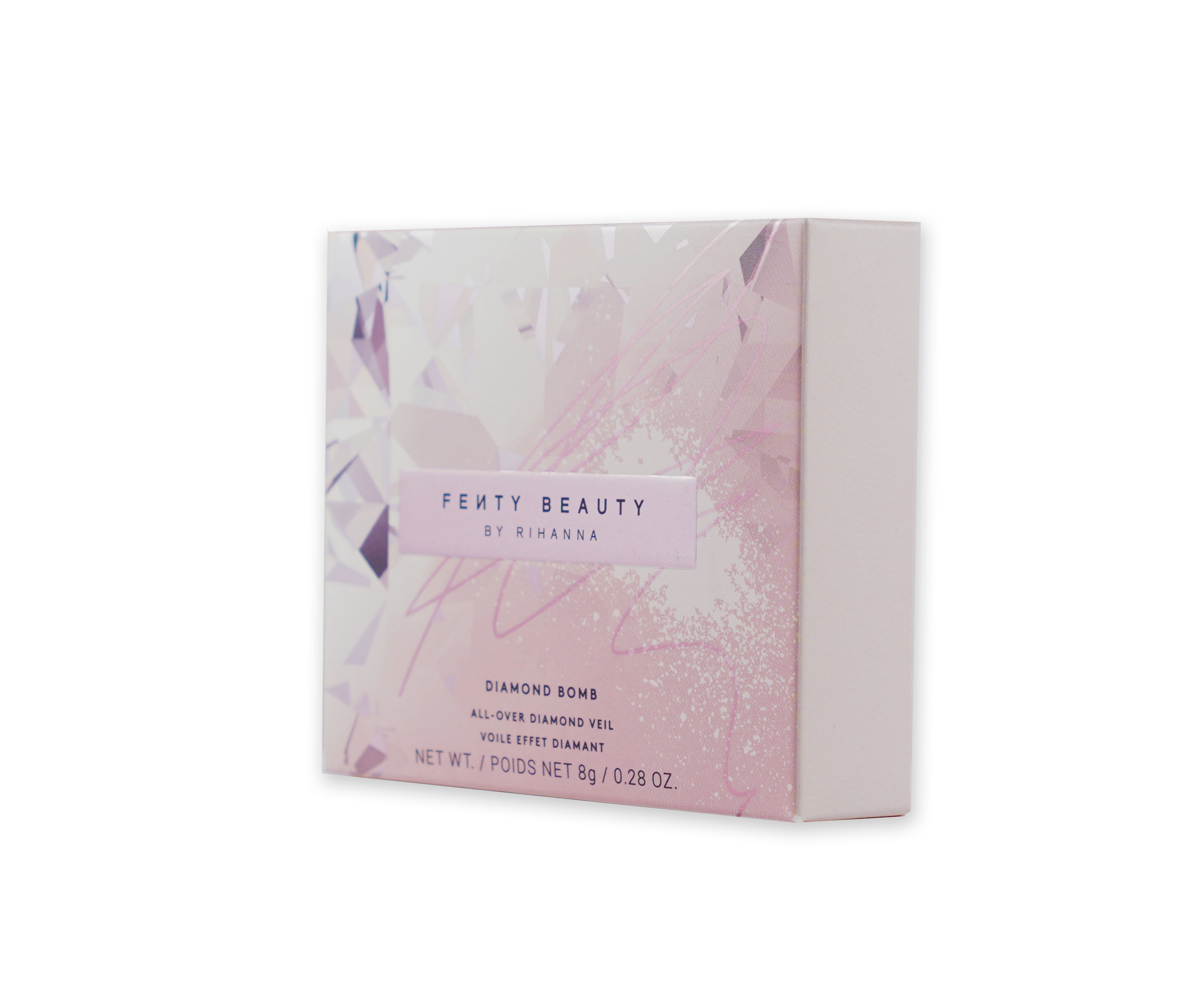
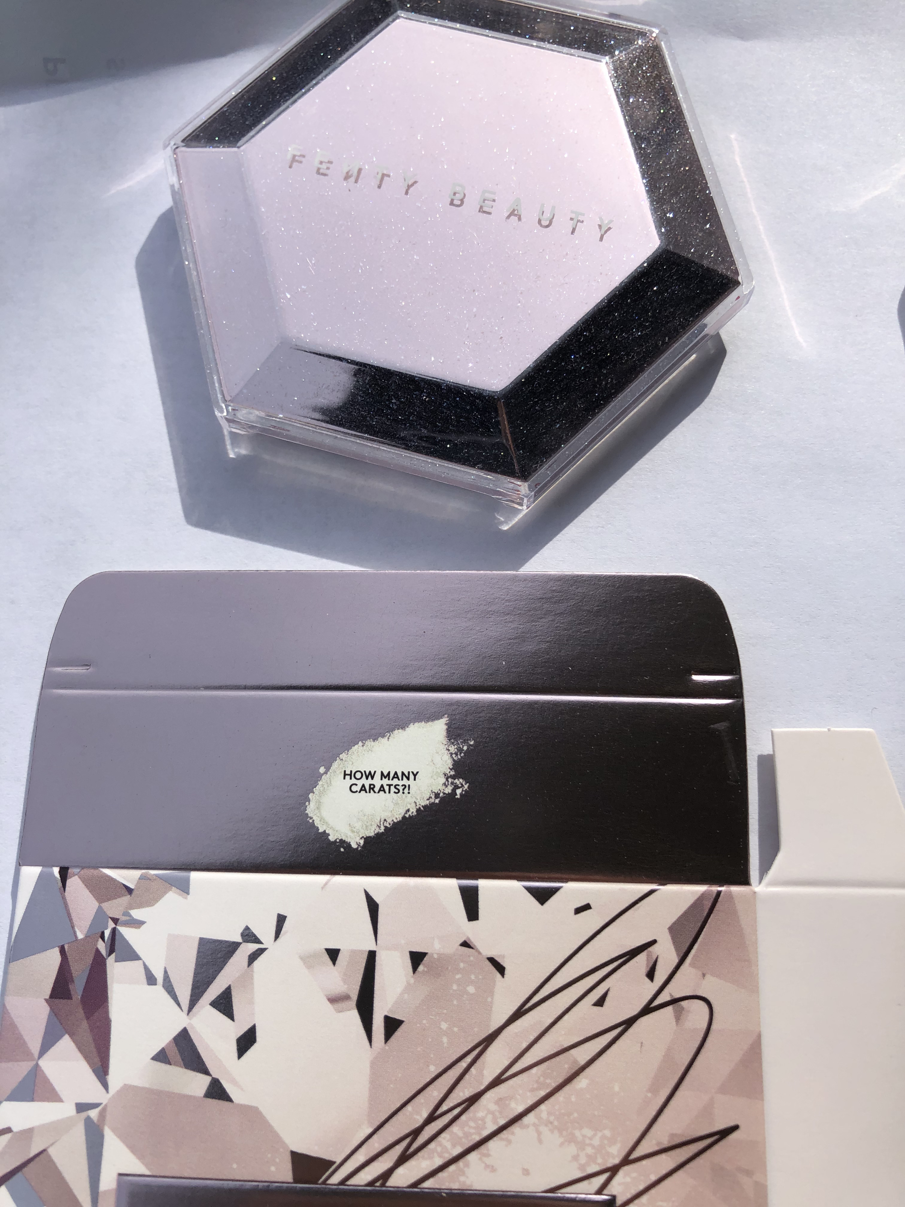
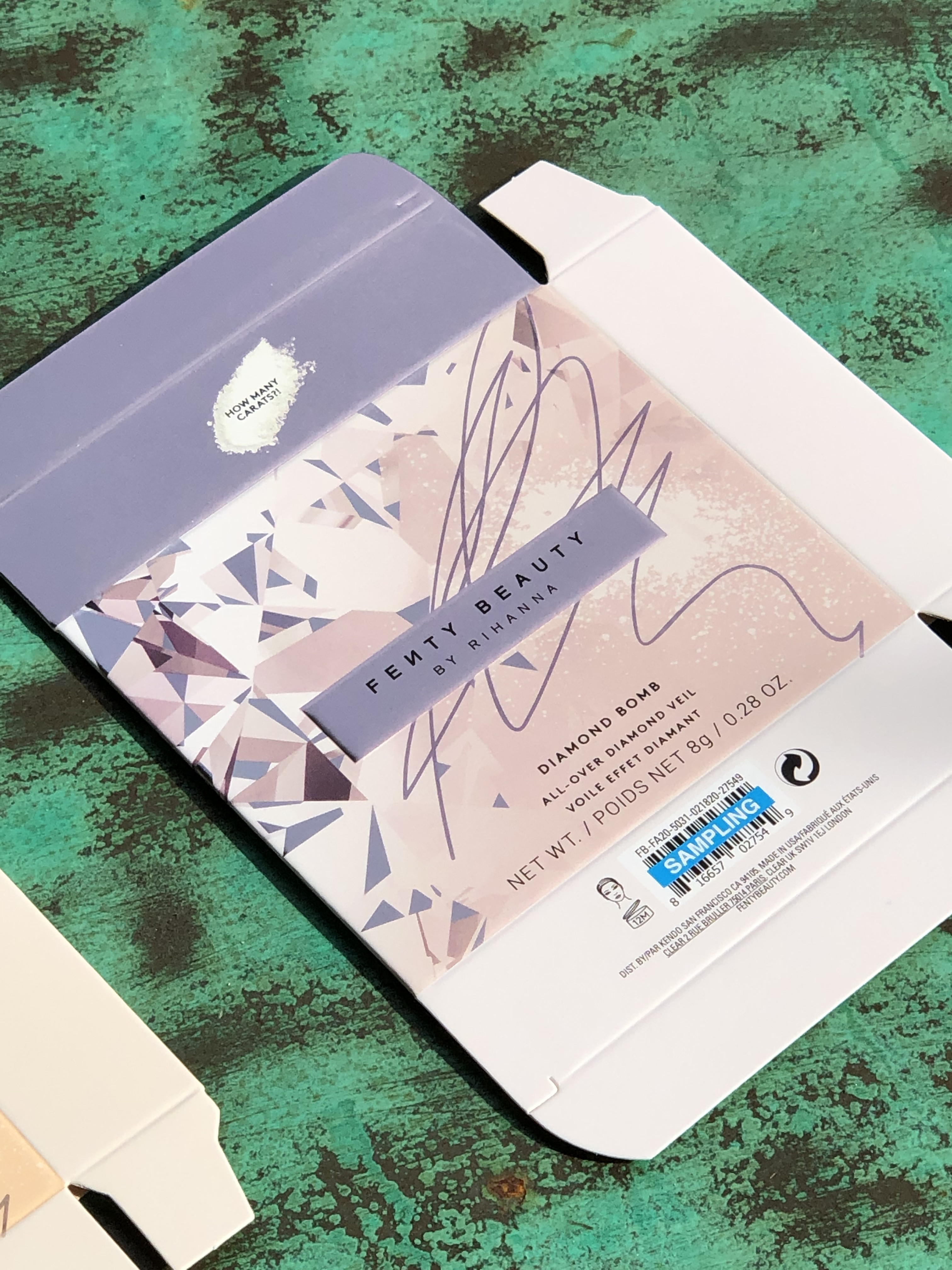
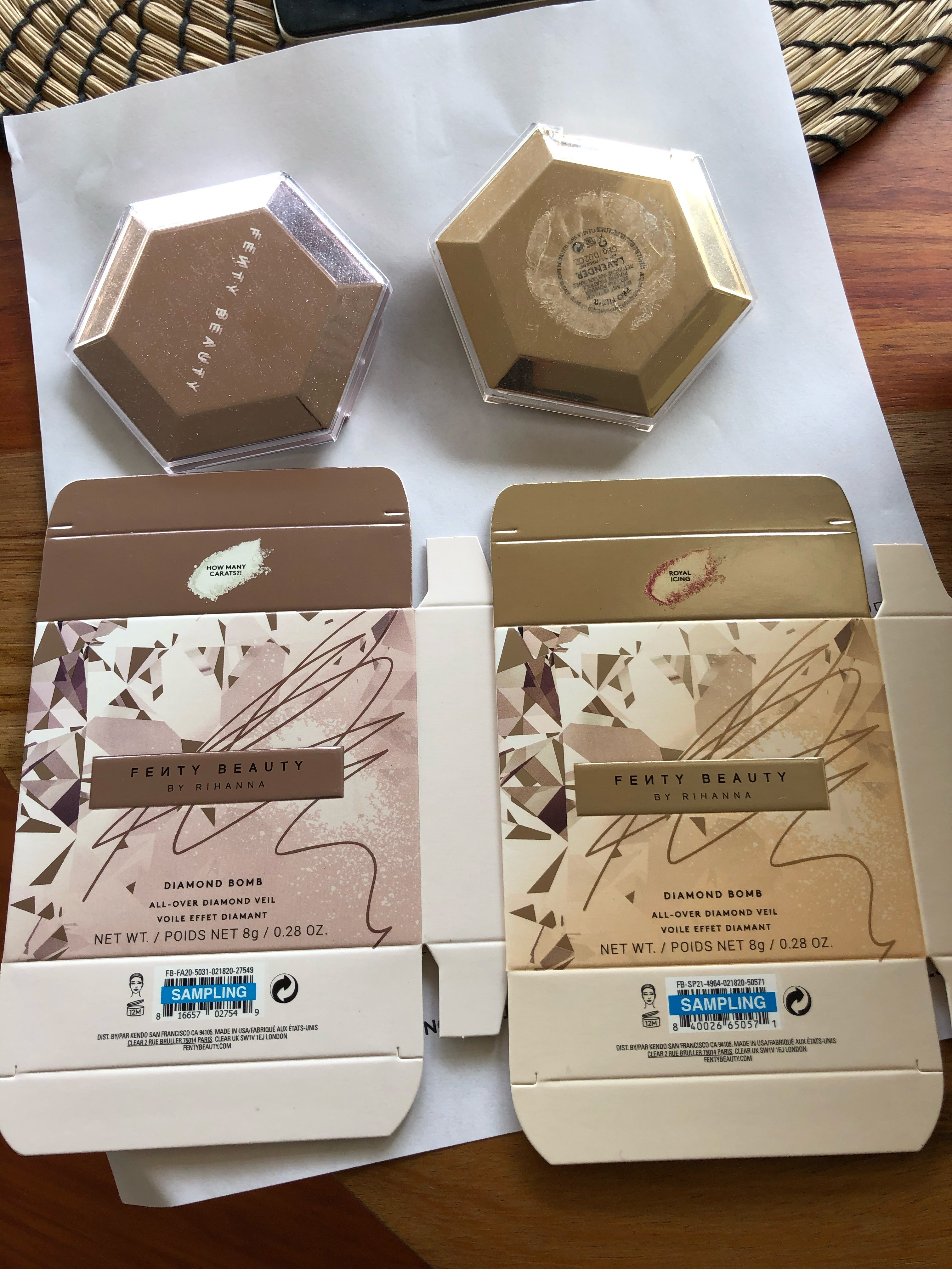
Diamond Bomb packaging uses highly reflective foil stamps mixed with clear UV gloss to reflect the glitter and bright colors of the makeup. Each packaging was color matched to the makeup shade to provide distinction.
The Snap Palettes primary reflected the look of the packaging to maintain consistency of the number system. The numbers are hot stamped with a
silver foil with the logo printed on top.
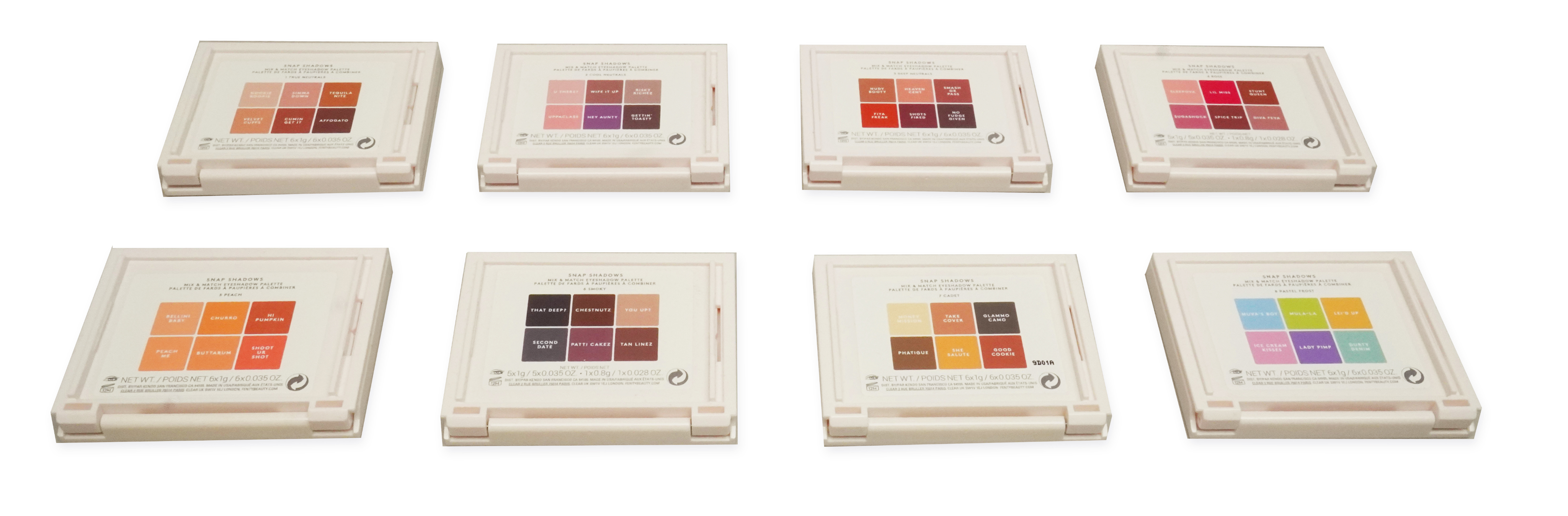
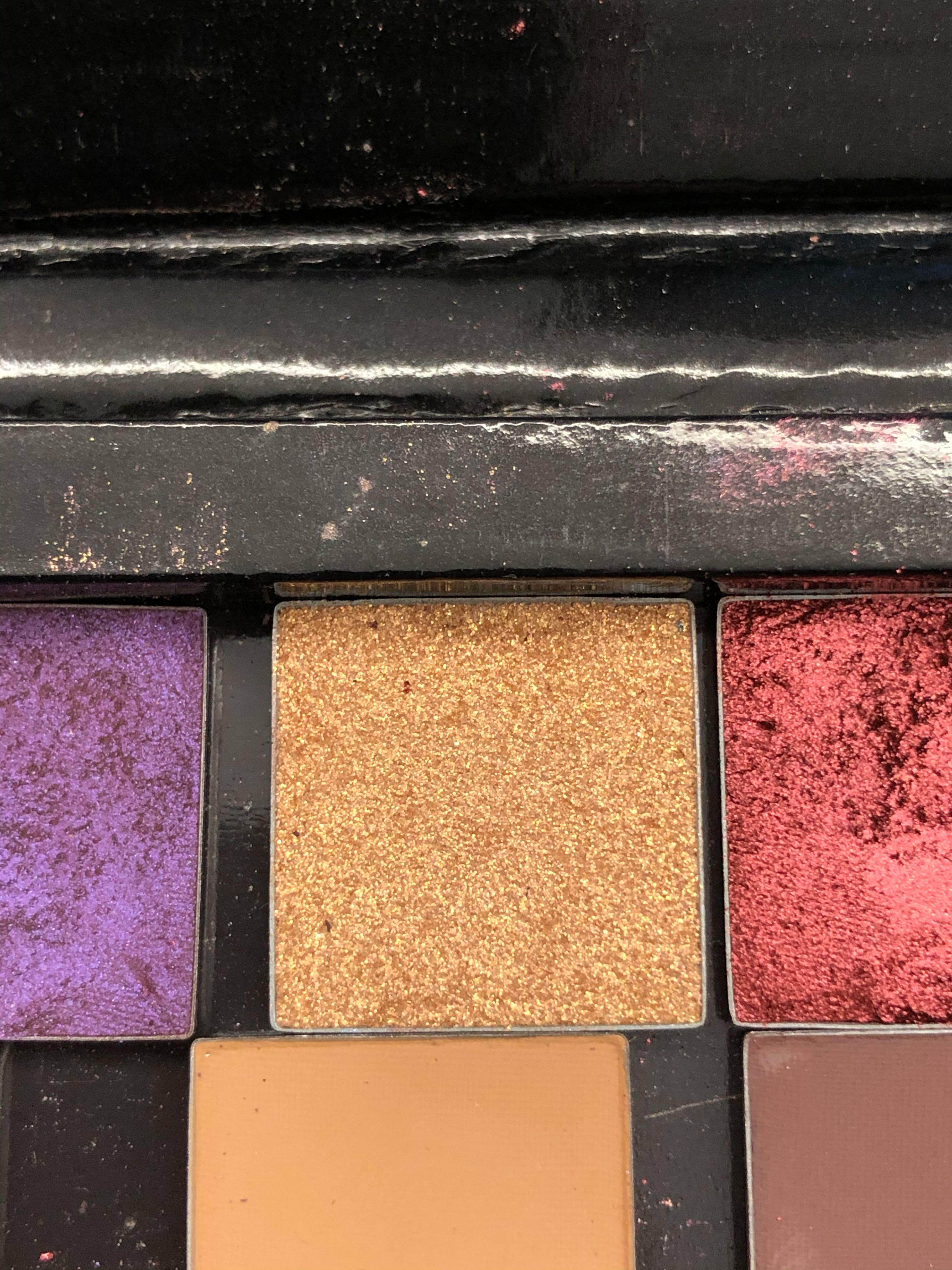
The shades are indicated on the back and
the palettes can snap together so the user can easily combo the shades and carry the palettes around.
Diamond Bomb primaries were also matched the the shade of the makeup formula. They were a simple design with the logo printed
on top and a bottom label to show what
shade it is.
Development & Production
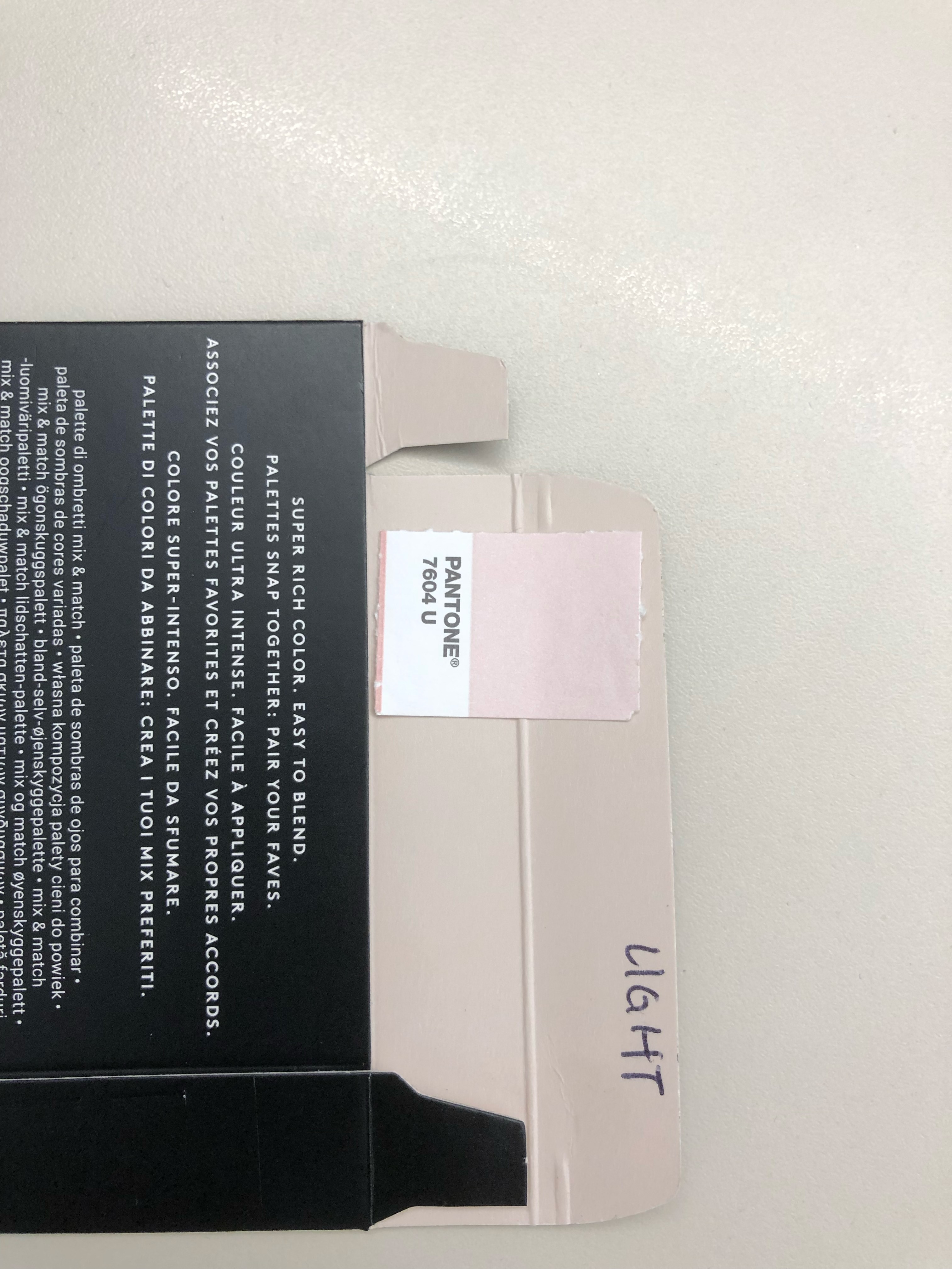
The interior carton had a flood of color. It was a Panton color and we dialed it in through samples and post production range boards.
The numbers on the unit carton and palettes used a spray painted design. There are small droplets on the edges that required lots of attention to make sure the registered when printed.
The smears on the carton and shade labels had to be color matched to the formula. This was done using thePantone Plus book as a baseline andthen dialing in the 4-color so it matches the actual shades.
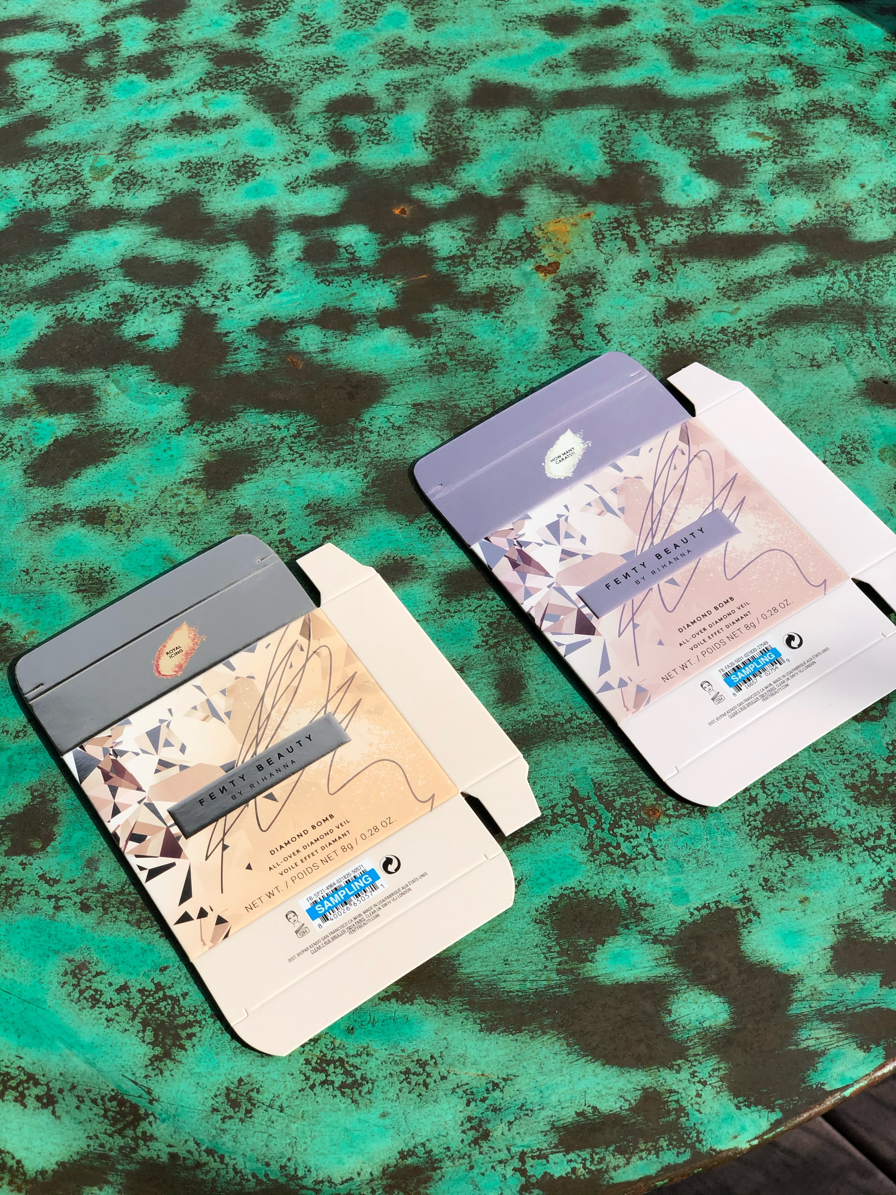
The Diamond Bomb cartons went through a number of rounds of sampling. We mostly were seeing how the foil contrasted with the color and making sure the colors were well balanced.
Primary components were used as a baseline to ensure the color of the unit carton was dialed in correctly.
Since this was designed during Covid there was no access to our offices to use the
light booth. Sunlight and my outdoor table instead was my next best thing to dial
in color.
RYAN WONG
brand design & production