SQUARE HANDHELD
Block
Production Designer
RYAN WONG
brand design & production
SQUARE HANDHELD
Block
Production Designer
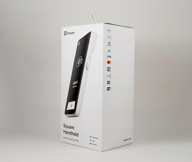
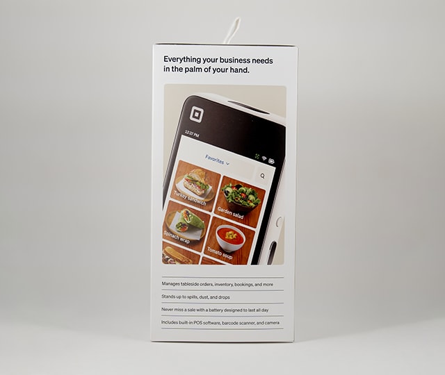
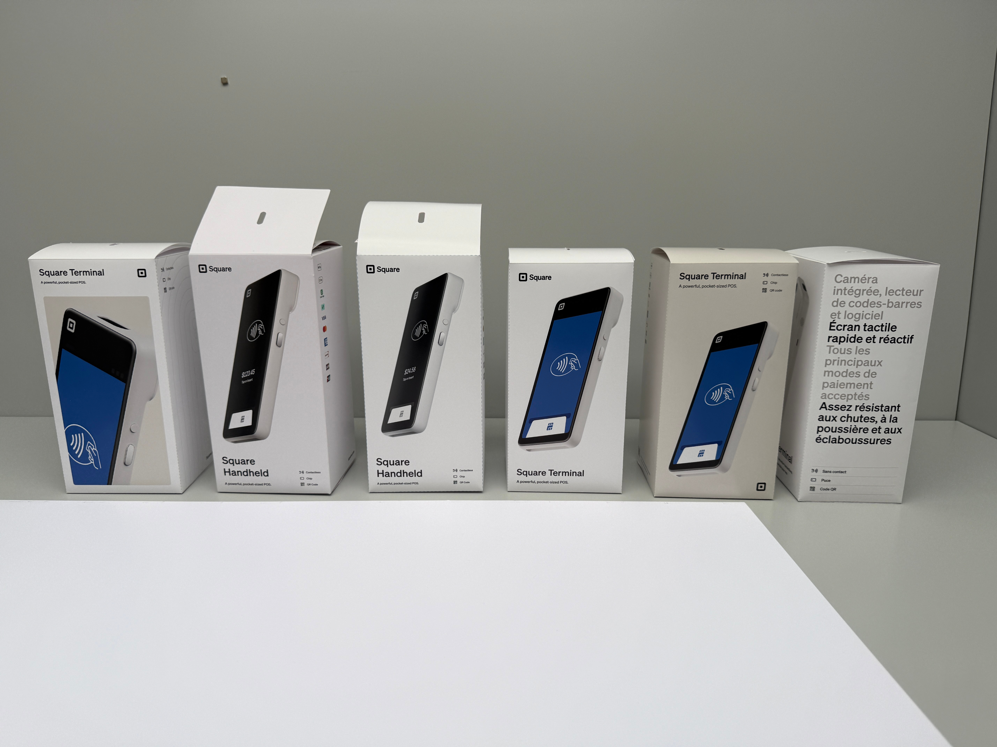
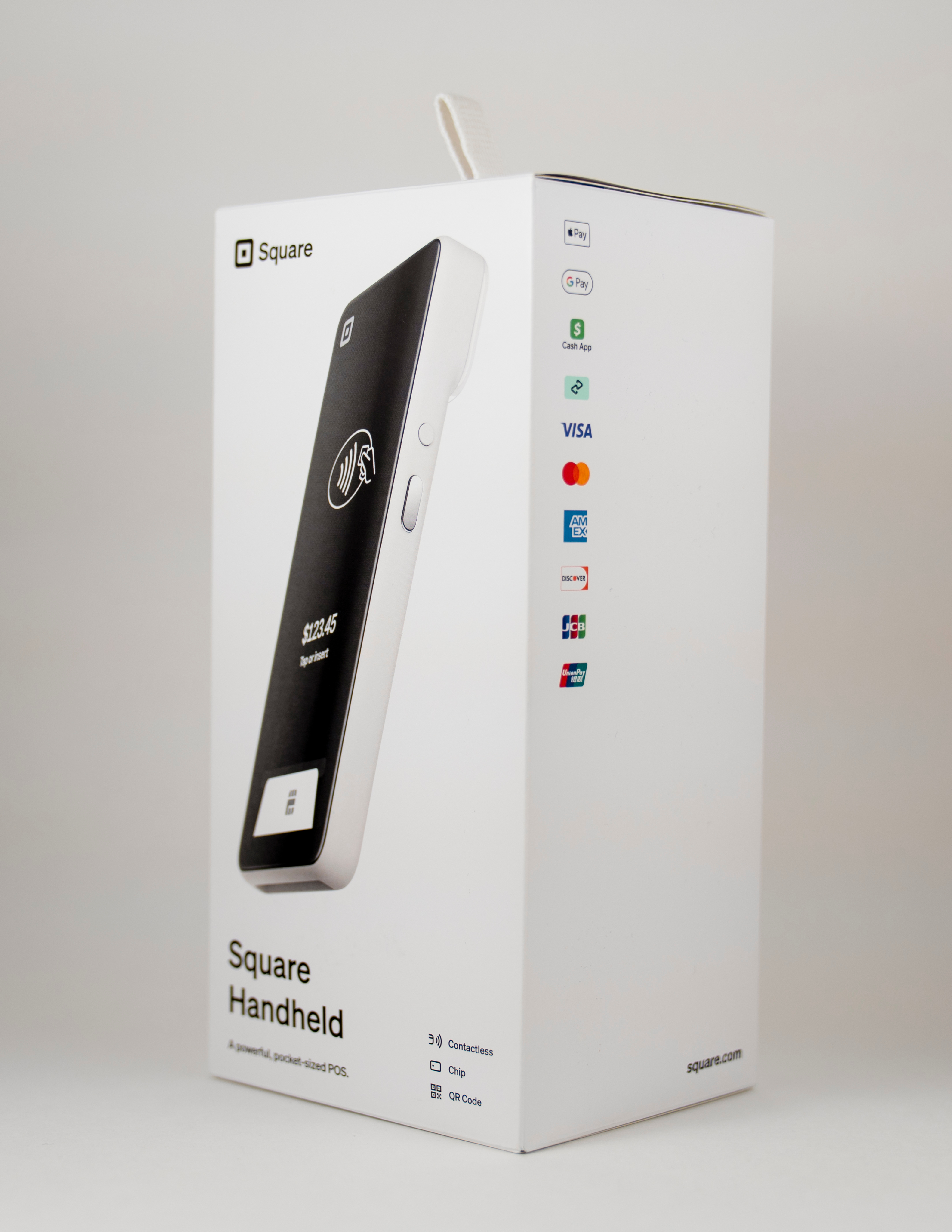
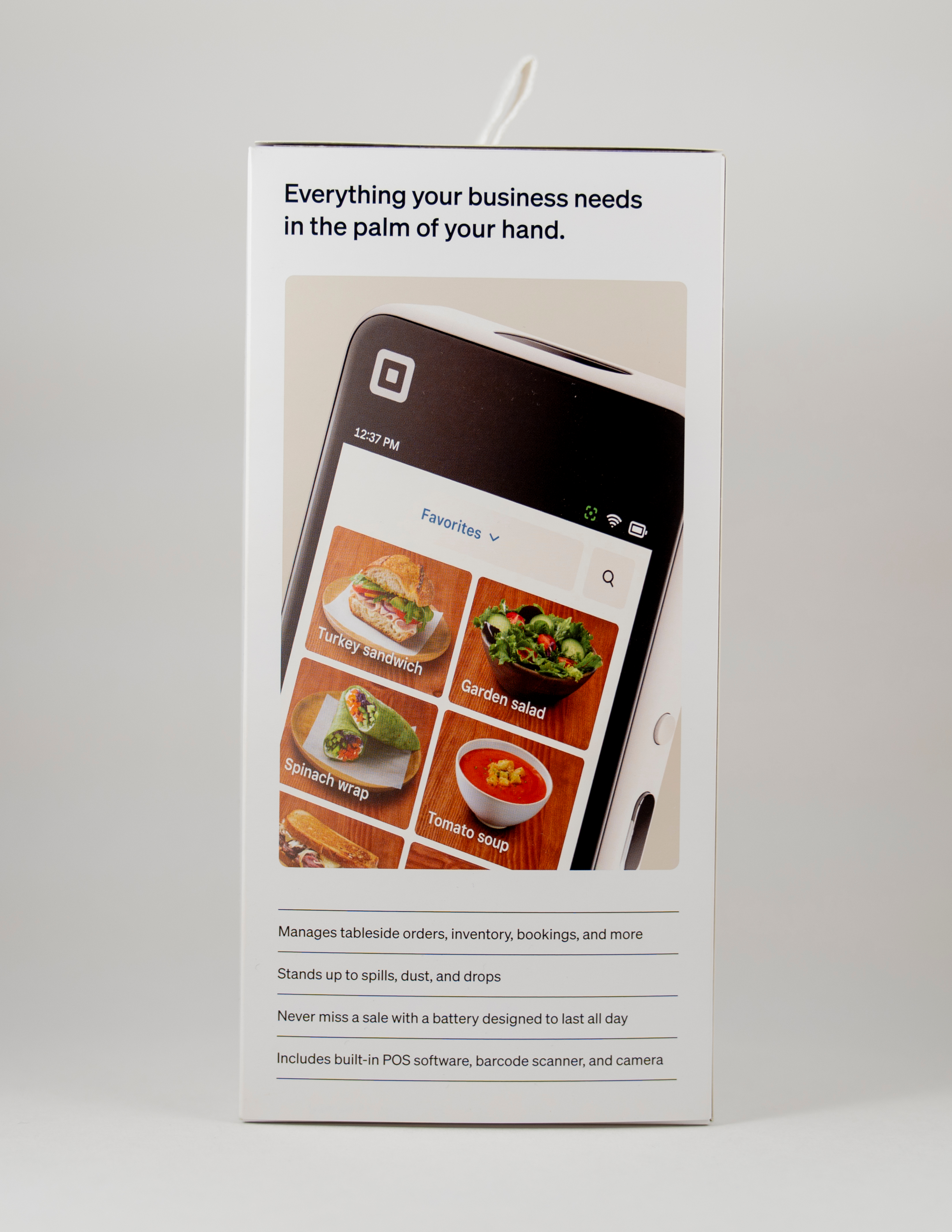
The design used similar elements from other Square product packaging. Logo placement, hero image and in situation image on the back helped make the Handheld integrated into the broader family of packaging for Square.
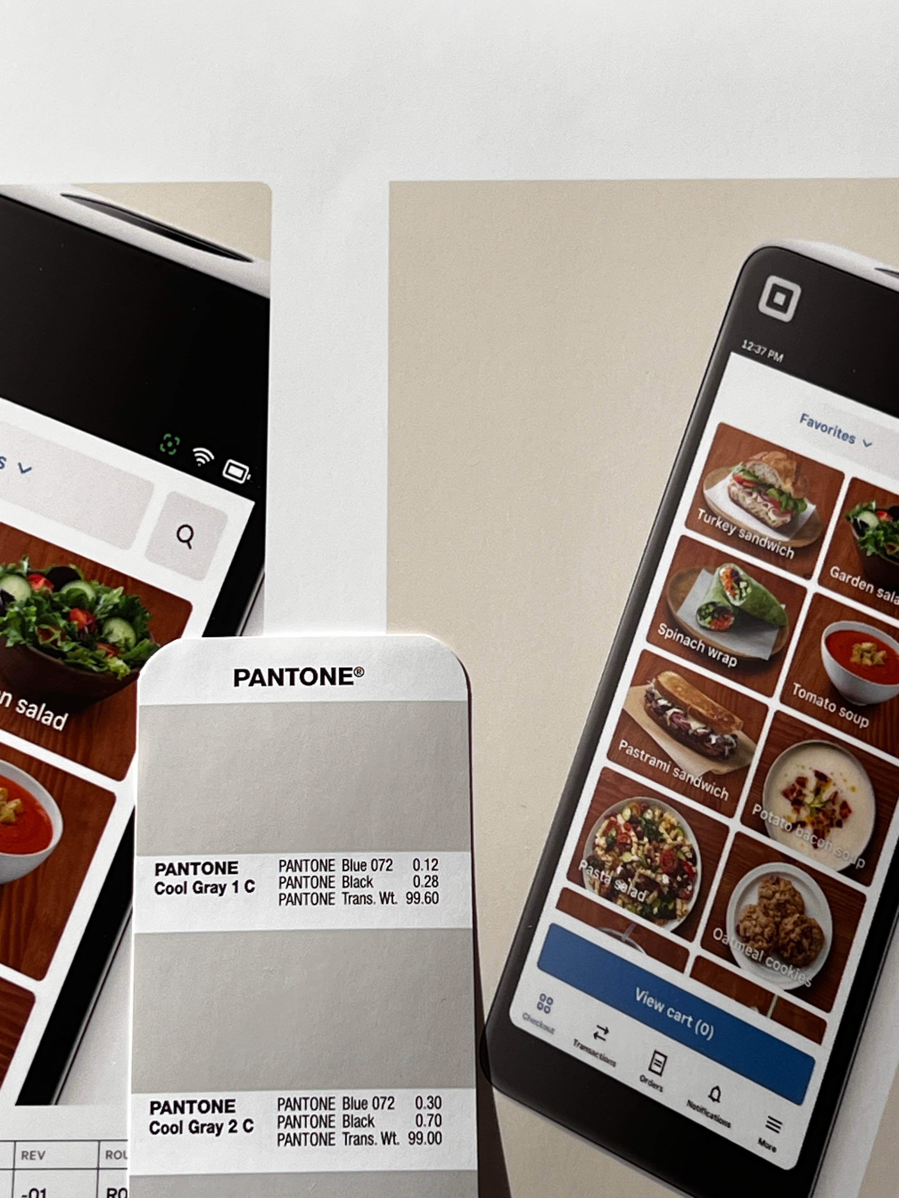
There were no special finishes on the boxes and everything printed 4-Color. The front hero image had the most production work, because the product is white with a white background. A special color profile was used so the image had good contrast against the background.
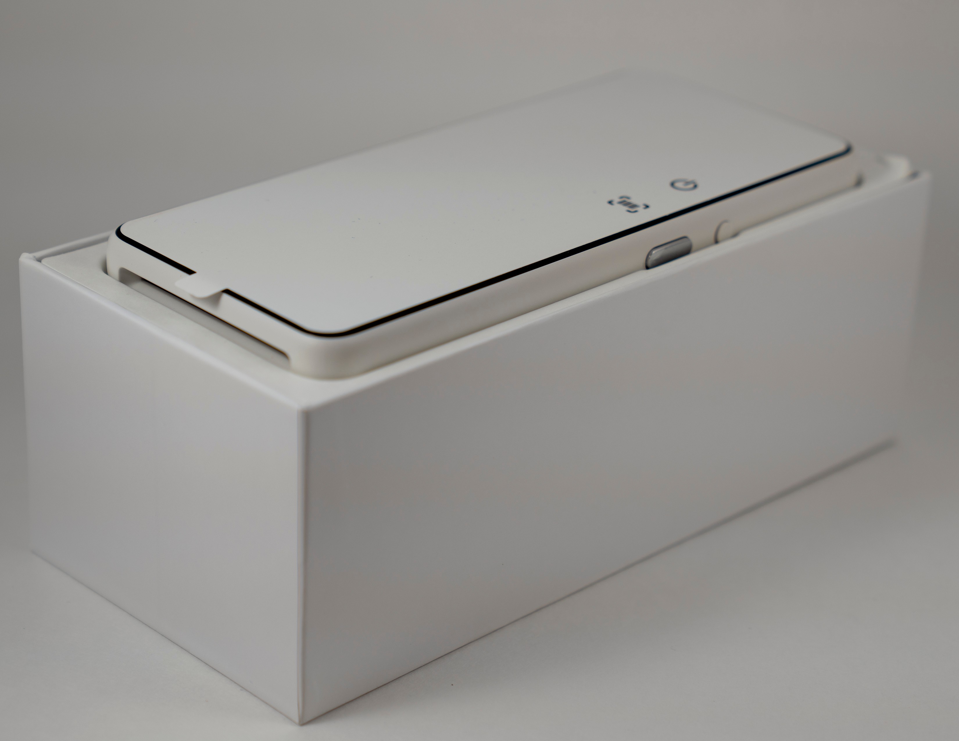
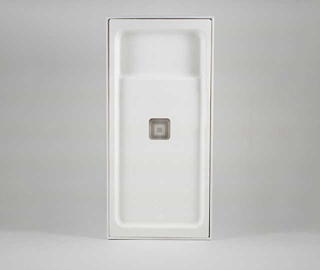
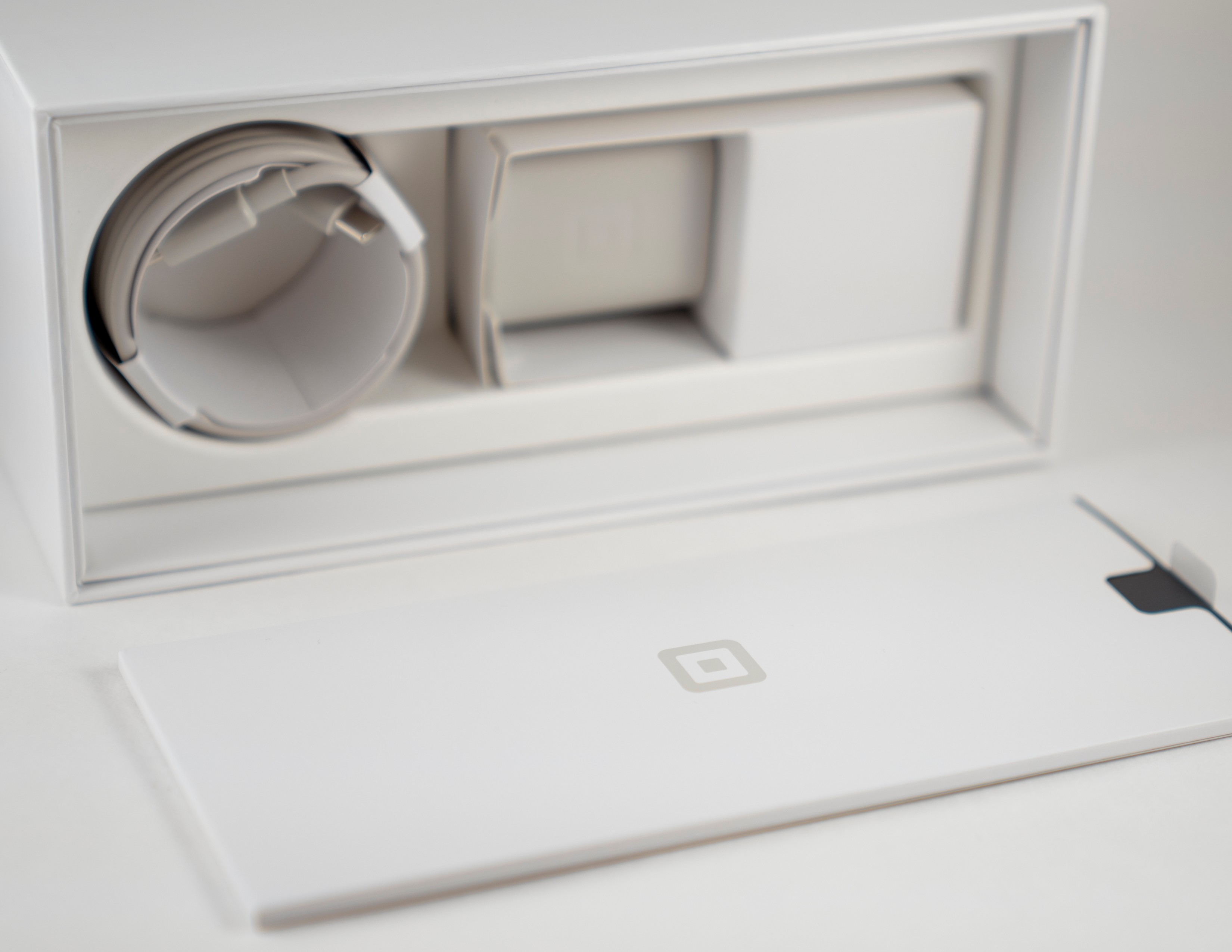
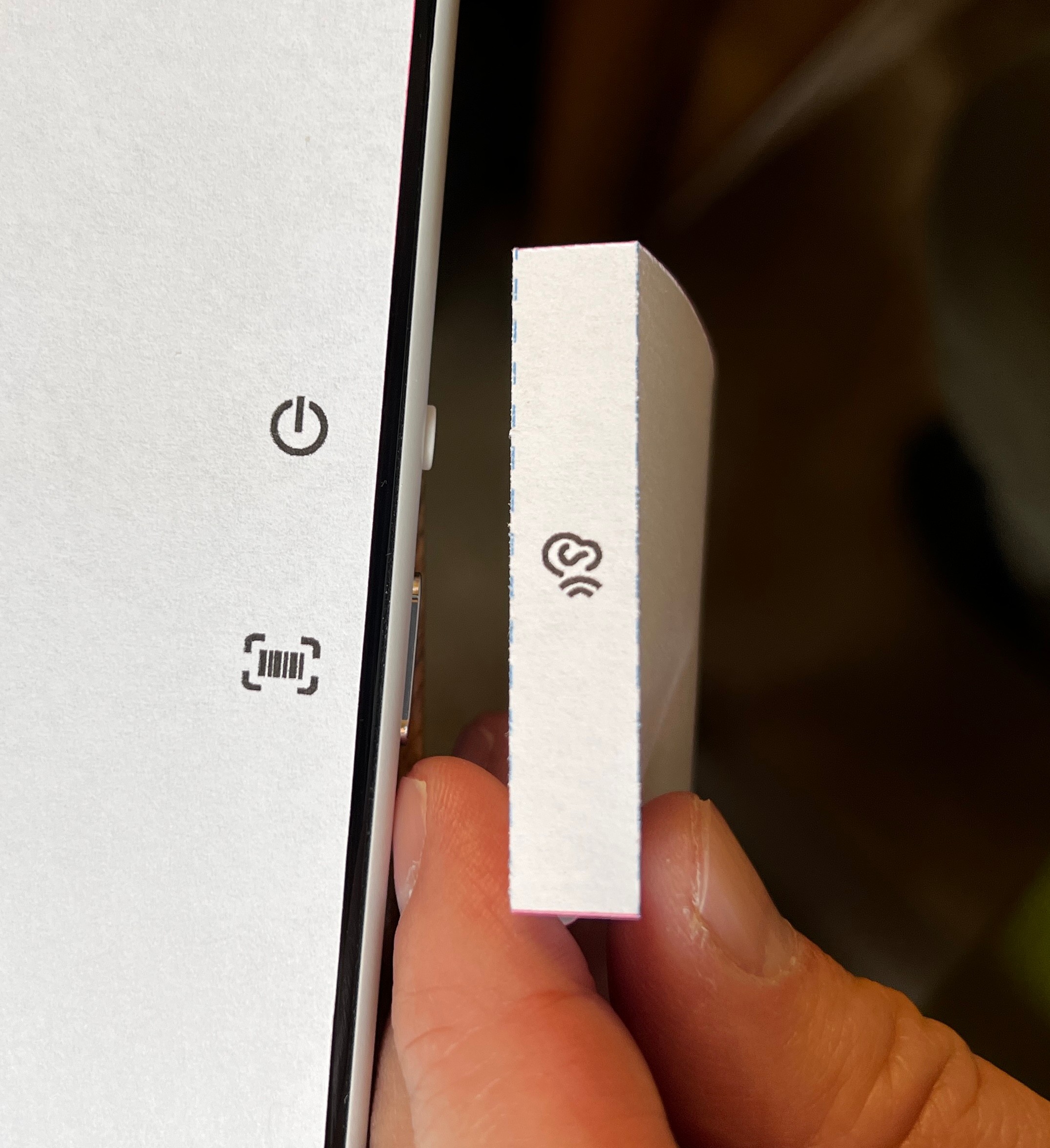
Outside of the exterior unit carton there was an inner tray and accessory box that received small details like icons and copy.
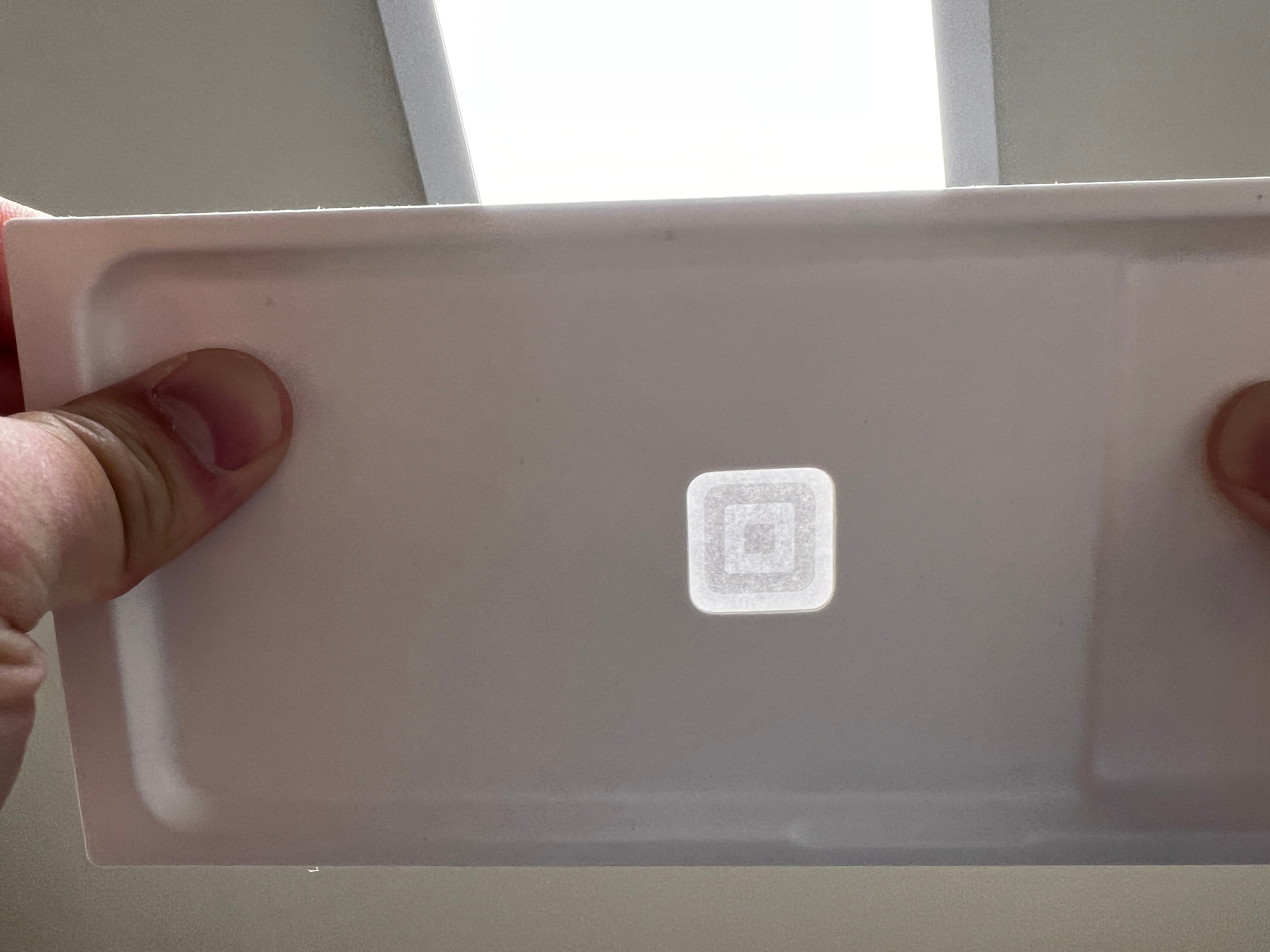
New features like the art on the cut out in the tray or the screen cover were carefully designed to adhere to the existing design system.
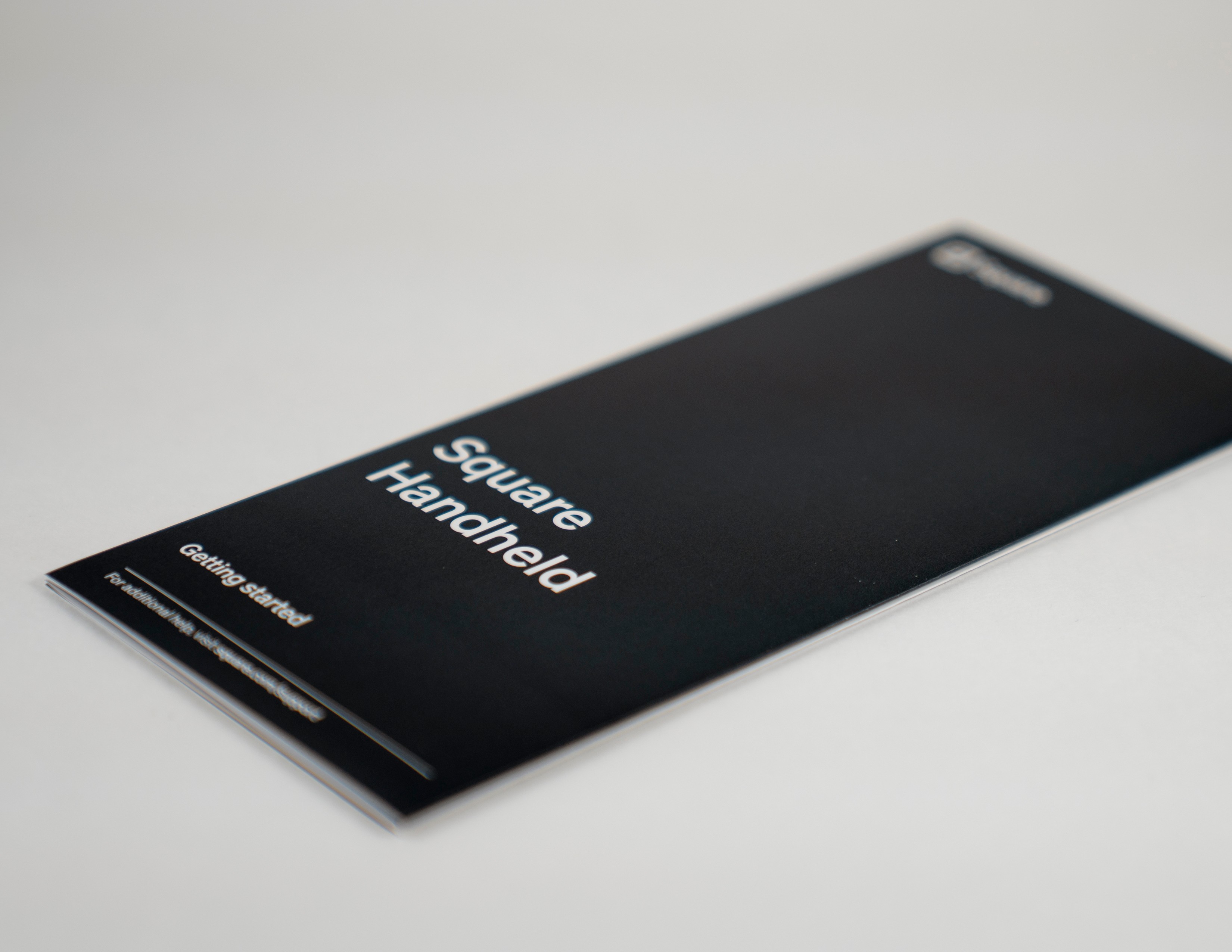
The Get Started guide was kept in an envelope that rested under the product tray. The logo on the envelope lined up with the tray cut out.
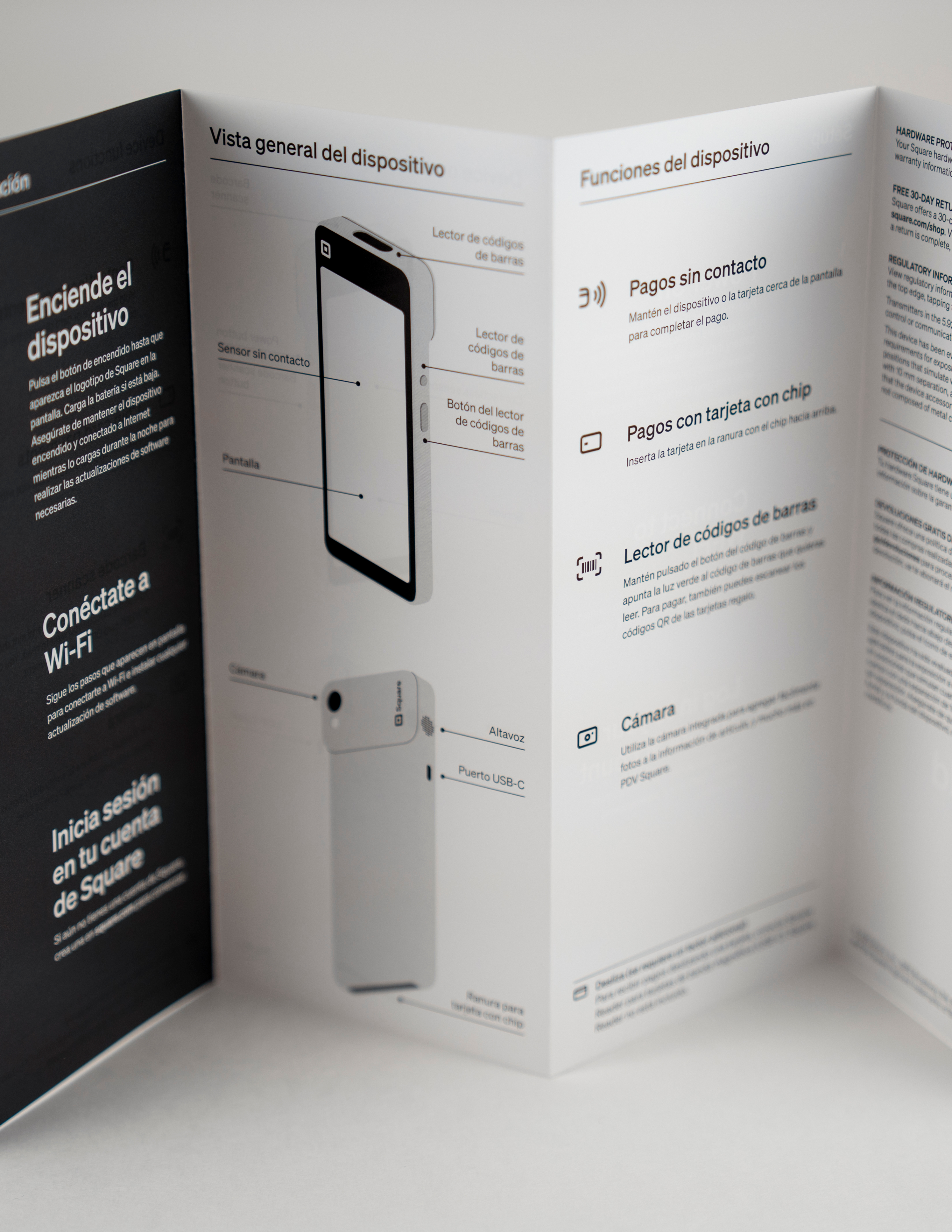
We wanted the Seller to be able to easily set up their handheld in several easy steps, so we made it as brief as we could.
Copy was spread out and the artwork heavily relied on illustrations to show set up.
Development & Production
Around 20 concepts were generated – testing image placement, choosing the right screens for the product image and figuring out what color system worked.
Little details like sizing icons and lining up with cutouts were heavily thought through and scrutinized.
During development of the design we had to ensure certain elements of the art worked with the proposed design of the packaging dieline.
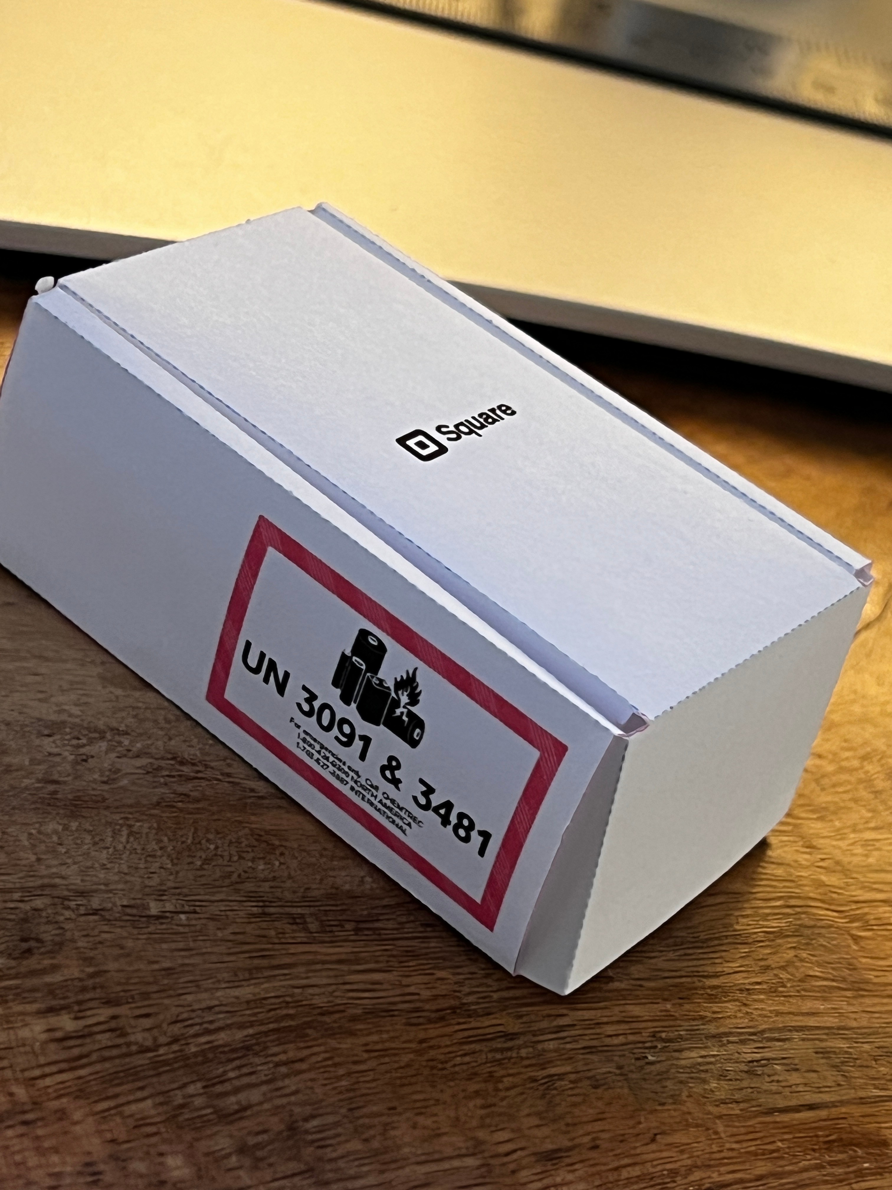
There is a shipper box with that contains the unit carton. Artwork was laid out and measured to ensure certain regulatory was met such as the battery warning icon.
We used an array of cool grays from the Pantone® book and ensured they would contrast with product images and type.
The artwork needed to also playinto the existing design system forSquare packaging.
RYAN WONG
brand design & production